TYPOGRAPHY GUIDELINES
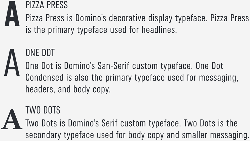
Our typography is designed to visually express our bold, playful, and authentic nature. One Dot, Two Dots, and Pizza Press are Domino's custom typefaces.
Get approved Domino’s fonts including Domino's One Dot, Two Dot and
Pizza Press.
DOMINO'S FONT KIT:
PIZZA PRESS
Pizza Press is Domino's decorative typeface. Pizza Press is intended to be used as a
complement to One Dot. Pizza Press is designed for headline display use. It is not intended for body
copy.
Use Pizza Press sparingly for headers and headlines.
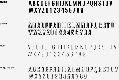
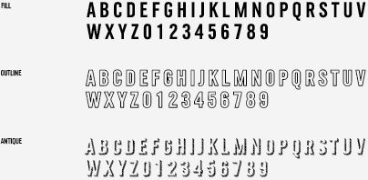
When using Pizza Press, set kerning to Metric. This will allow type layers to align correctly.
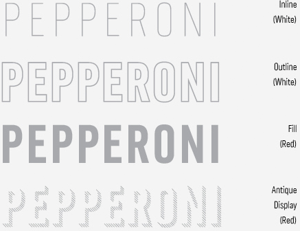
PIZZA PRESS REGULAR
Use Regular by itself. Do not use it in combination
with the other Pizza Press weights.

PIZZA PRESS FILL
Fill is spaced to accommodate being combined with the
other Pizza Press weights. If you would like to use the solid Fill by itself, we recommend using the
Regular weight instead, as it is spaced to be used alone.

PIZZA PRESS SHADOW
The Shadow weight does not require an outline, unless
when layering type a break between the Fill and Shadow weight is needed.

PIZZA PRESS OUTLINE
This Outline weight is designed to sit on top of the
Fill weight. It can be used to help separate the Fill from the Shadow weight or background.

PIZZA PRESS INLINE
Inline should never be used by itself. Layer it with
Fill and/ or Shadow weights.

PIZZA PRESS ANTIQUE
This Antique shadow has been designed to be the
bottommost layer in Pizza Press combinations. Antique should never be used by itself or at small type
sizes. Use Antique Display if you wish to use this at smaller type sizes.
Pizza Press Antique will be used sparingly and in limited cases.

Pizza Press Antique will be restricted to mainly packaging materials and some Domino's
graphics in very small uses, such as headers with secondary messaging.
PIZZA PRESS ANTIQUE DISPLAY
This Antique shadow has been created with
fewer shadow lines than its sister weight. This is so that it can be legible at smaller sizes. We do not
recommend going any smaller than 24 pt, as the clarity of the lines will begin to break down.

PIZZA PRESS IN USE
Each Pizza Press font (except Regular) allows layering of type. The most common usage is
Pizza Press Inline over Pizza Press Fill

PUTTING IT ALL TOGETHER
Domino's Pizza Press is intended to be used
sparingly alongside One Dot.
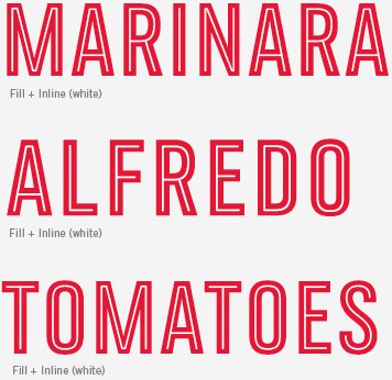
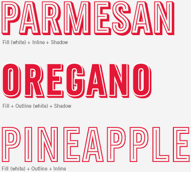
PIZZA PRESS FILL + INLINE

PIZZA PRESS SHADOOW + INLINE

PIZZA PRESS ANTIQUE + OUTLINE + FILL+ INLINE

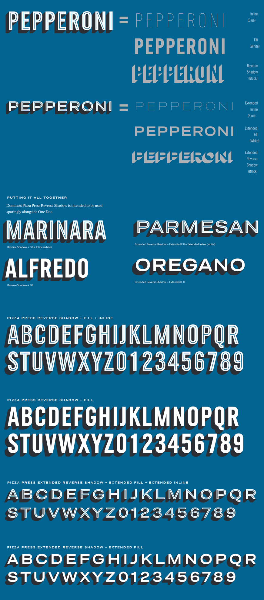
PIZZA PRESS REVERSE SHADOW
Pizza Press has been updated to include additional type treatments. These are used to
bring attention to headers, price points, and specific words. Pizza Press Reverse Shadow should only be
used with Pizza Press Fill and occasionally with Pizza Press Inline.
Use Pizza Press Reverse Shadow sparingly for headers and headlines.
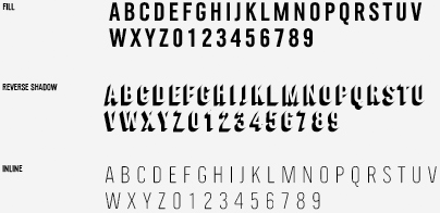
When using Pizza Press Reverse Shadow, set kerning to Metric. This will allow type layers to align correctly.
PIZZA PRESS FILL
Pizza Press Fill can also be used with Pizza Press
Reverse Shadow. Whenever using Fill with Reverse Shadow, make sure to have Fill on top. Fill is spaced
to accommodate being combined with the other Pizza Press weights. If you would like to use the solid
Fill by itself, we recommend using Pizza Press Regular instead, as it is spaced to be used alone.

PIZZA PRESS REVERSE SHADOW
Pizza Press Reverse Shadow should be used to
bring attention to headers, price points, and specific words. When layering type with Pizza Press Fill
and Inline, make sure to layer Reverse Shadow on the bottom. Do not use Pizza Press Reverse Shadow by
itself.

PIZZA PRESS INLINE
Inline should never be used by itself. Layer it with
Fill and/or Reverse Shadow. Inline should be used sparingly to bring even further attention to a
specific header or word.

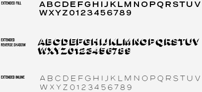
PIZZA PRESS EXTENDED FILL
Pizza Press Extended Fill is a new addition to
the family. Extended Fill can be used with Pizza Press Extended Reverse Shadow. Extended Fill is spaced
to accommodate being combined with the other Pizza Press weights. If you would like to use the solid
Extended Fill by itself, we recommend using One Dot Extended Bold instead, as it is spaced to be used
alone.

PIZZA PRESS EXTENDED REVERSED SHADOW
Pizza Press Extended Reverse Shadow
should be used to bring attention to headers, price points, and specific words. When layering type with
Pizza Press Extended Fill and Extended Inline, make sure to layer Extended Reverse Shadow on the bottom.
Do not use Pizza Press Extended Reverse Shadow by itself.

PIZZA PRESS EXTENDED INLINE
Pizza Press Extended Inline should never be
used by itself. Layer it with Extended Fill and/or Extended Reverse Shadow. Extended Inline should be
used sparingly to bring even further attention to a specific header or word.

PIZZA PRESS REVERSE SHADOW IN USE
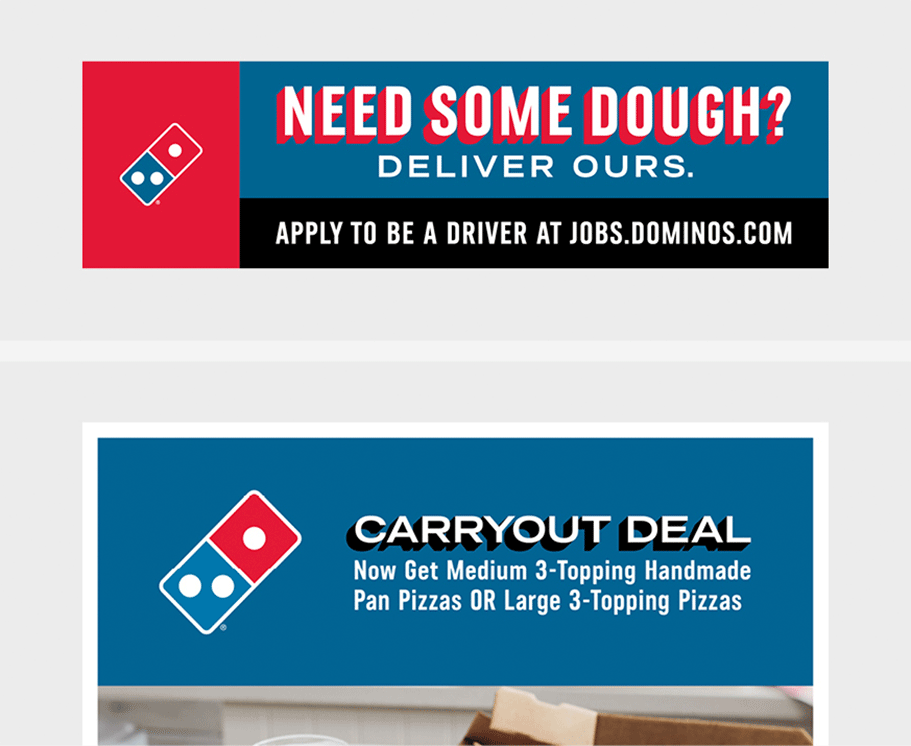
Use Pizza Press Reverse Shadow and Extended Reverse Shadow sparingly on headers, price points, and specific messaging. Use this treatment as a way to bring attention and focus to a word or specific phrase.
For important headers, Pizza Press Reverse Shadow and Pizza Press Extended Reverse Shadow
can be used. This application is a viable option to bring certain language to the top of the hierarchy.
Pizza Press Reverse Shadow and Pizza Press Extended Reverse Shadow should never be used
alone.
PIZZA PRESS REVERSE SHADOW OVER A BLUE BACKGROUND
PIZZA PRESS REVERSE SHADOW OVER A LIGHT BACKGROUND
WORK IN PROGRESS
PIZZA PRESS REVERSE SHADOW OVER IMAGE
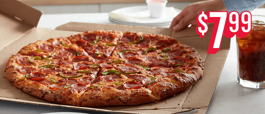
An additional stroke can be added to help separate the copy from the
background image.
EXAMPLES ON COLOR
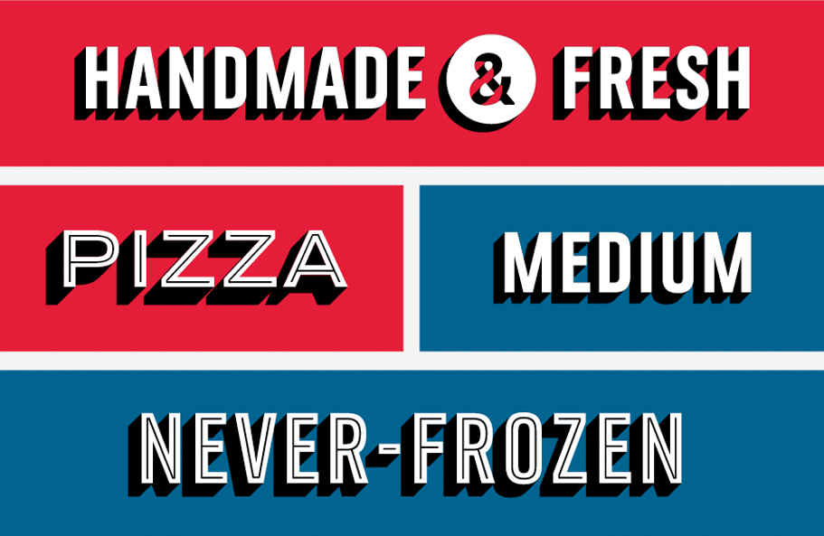
PIZZA PRESS REVERSE SHADOW DO'S
Below are Pizza Press Reverse Shadow combinations that are allowed. Pizza Press Reverse
Shadow should only be used to emphasize and bring attention to headers, price points, and specific
words.
DO EXAMPLES
PIZZA PRESS REVERSE SHADOW DO NOT'S
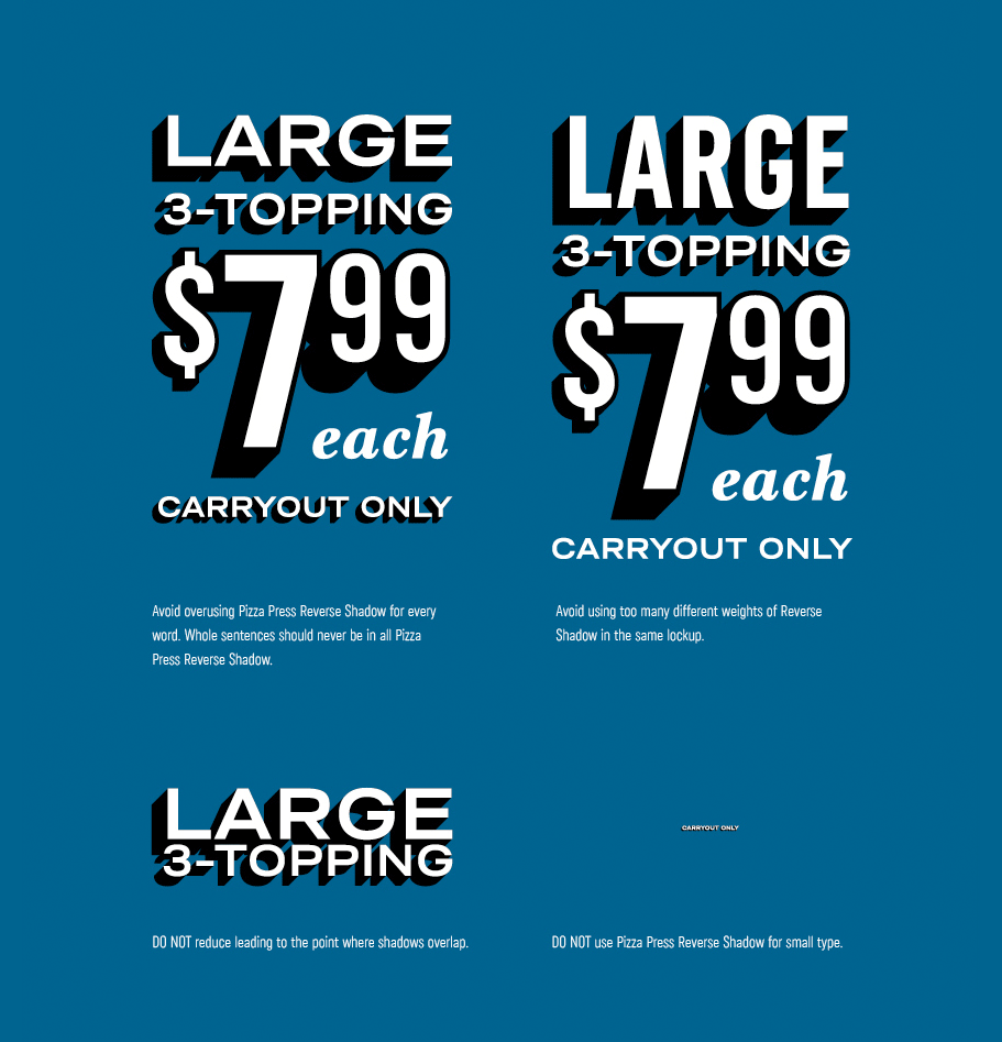
Below are Pizza Press Reverse Shadow combinations that should be avoided. Do not overuse
Pizza Press Reverse Shadow.
DO NOT EXAMPLES
ONE DOT
ONE DOT CONDENSED
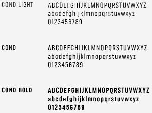
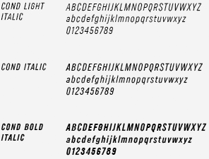
One Dot Condensed is Domino's most used font. You will
see it used everywhere from legal copy to bold headlines on billboards. The narrow nature of the font
makes it the top choice when messaging requires large attention-grabbing headlines or low-key legal.

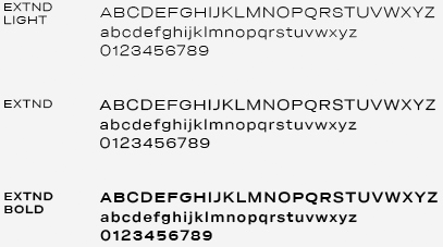
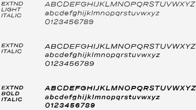
ONE DOT EXTENDED
One Dot Extended is the second most used font in the One
Dot family. It is a great complement to One Dot Condensed because of the visual contrast in the width
and height of the two fonts. One Dot Extended's wide width causes it to take up a lot of horizontal
space so it is ideal for brief messaging.

ONE DOT REGULAR
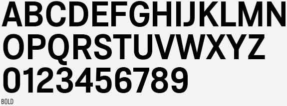
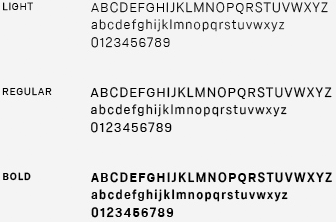
One Dot Regular is the font least used in the One Dot
family. It can be used for body copy or as an accent to One Dot Extended or One Dot Condensed.
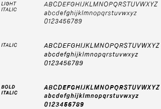
TWO DOTS
TWO DOTS REGULAR
Two Dots Regular is occasionally used for body copy.


TWO DOTS BOLD
Two Dots Bold is occasionally used for headlines.


TWO DOTS BLACK
The most common application of Two Dots Black Italic is on
the word "each" on a price point.


PRICE POINTS
Use approved price point graphics when paired with messaging.
APPROVED PRICE POINT GRAPHICS
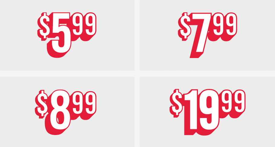
PRICE POINTS IN USE
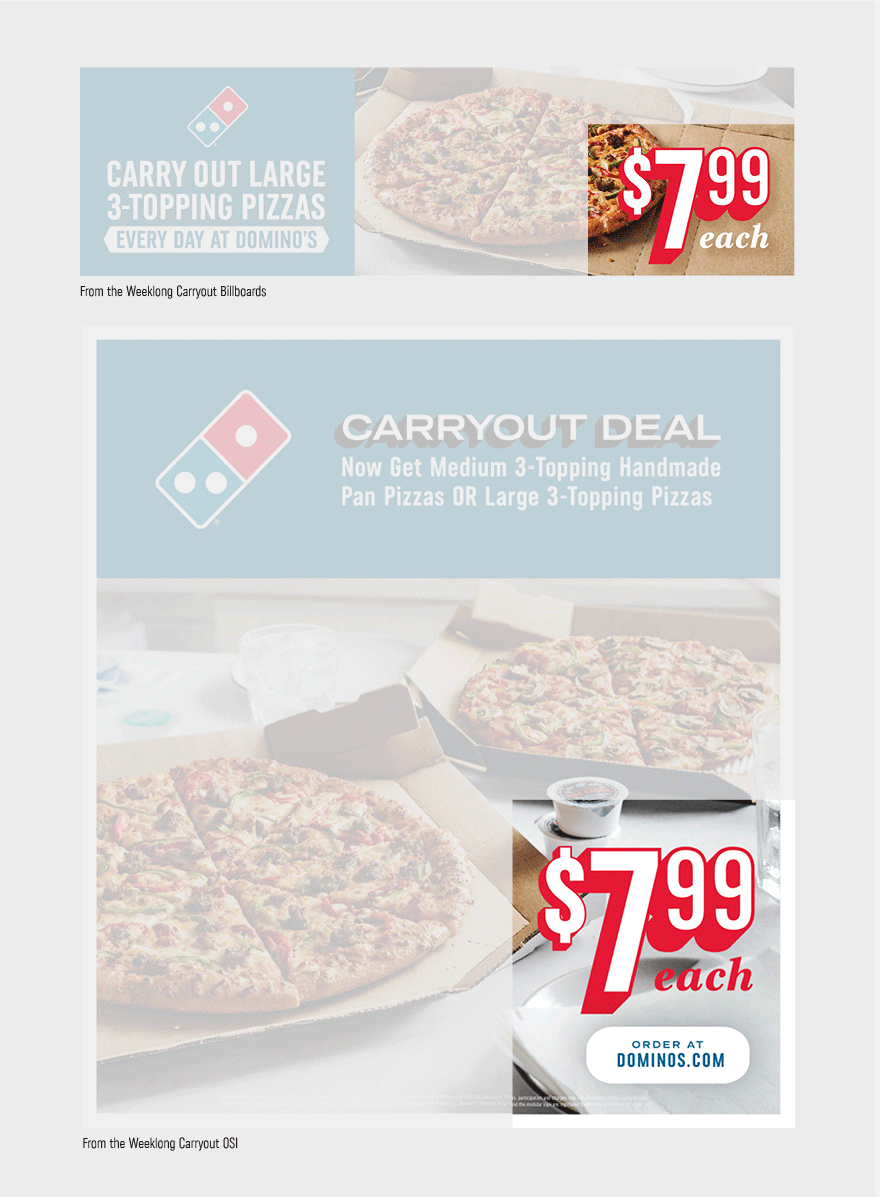
PRICE POINT DO'S
Below are examples of price point graphics used properly in combination with type or over
image.
DO EXAMPLES
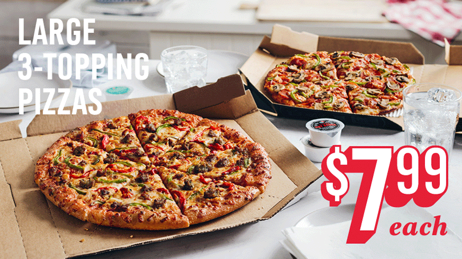
DO place price point graphics in empty spaces of the image.
Price points do not have to be paired with type but should be
prominent in the layout.
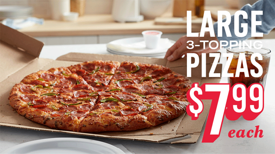
DO place price point graphics paired with type in empty spaces
of the image.
PRICE POINT DO NOT'S
Below are examples of price point graphics to avoid in combination with type or over
image.
DO NOT EXAMPLES
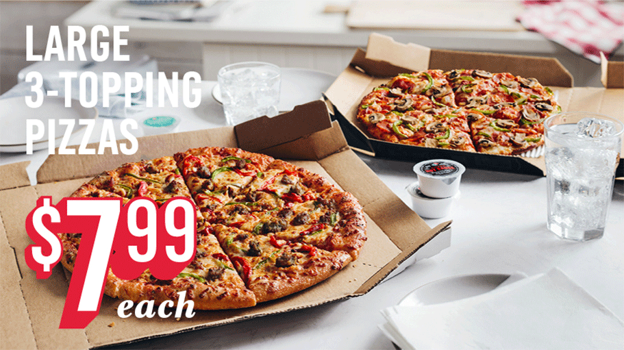
DO NOT place price point graphic over majority of the food if
there is empty space available. In smaller layouts, the price point graphic may overlap some
of the food but not completely.
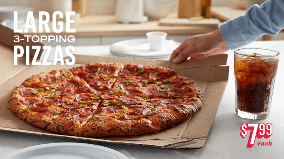
DO NOT make the price point graphic overly small compared to
the rest of the elements in the layout. The price point should be prominent on the page and
balanced with the type.
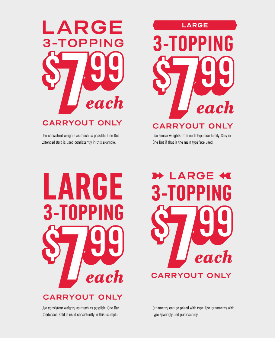
TYPOGRAPHY DO'S
Below are combinations of Domino's typefaces that are allowed. The basic rule of thumb is
to avoid using too many typefaces in combination.
DO EXAMPLES
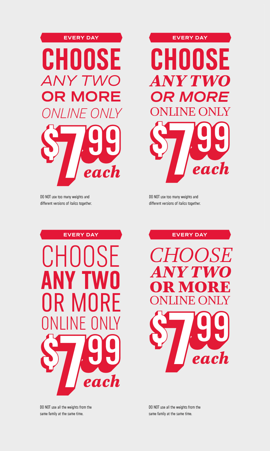
TYPOGRAPHY DO NOT'S
Below are combinations of Domino's typefaces that should be avoided. The basic rule of
thumb is to avoid using too many typefaces in combination.
DO NOT EXAMPLES
TRACKING DO NOT'S
DO NOT EXAMPLES
TYPE OVER IMAGE GUIDELINES
To increase visual contrast when type is over an image, a drop shadow can be applied to
the type.
Drop shadows should be subtle and unobtrusive to the image when applied.
TYPE DROP SHADOW DO'S
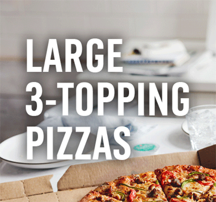
DO EXAMPLES WHEN OVER EMPTY SPACE OF AN IMAGE
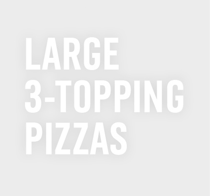
Use a black drop shadow at 10% opacity when placing type over an empty space
in the image. DO NOT use black drop shadow when type is over food.
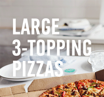
The size of the shadow should not expand too far from the type. The size of
the shadow can be adjusted depending on the size of the type.
DO EXAMPLES WHEN OVER FOOD
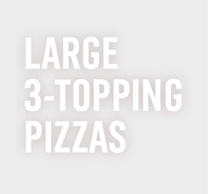
When it is unavoidable that type must be placed over food, use a dark brown
drop shadow at 10% opacity to help the drop shadow blend into the image.
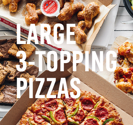
The size of the shadow should not expand too far from the type. The size of
the shadow can be adjusted depending on the size of the type.
TYPE SHADOW DO NOTSTYPE SHADOW DO NOTS
DO NOT EXAMPLES WHEN OVER EMPTY SPACE OF AN IMAGE
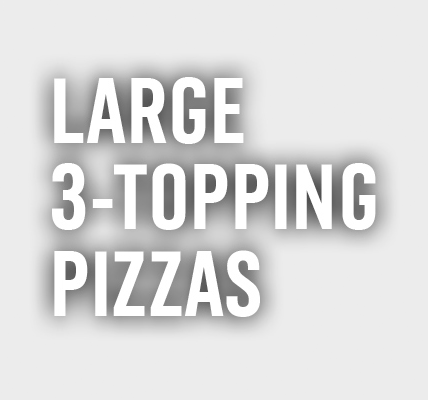
DO NOT make the opacity of the shadow more than 20%. More than 20% will make
the shadow too noticeable and not subtle.
DO EXAMPLES WHEN OVER FOOD
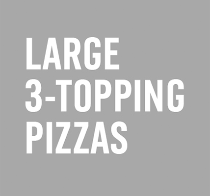
DO NOT completely darken the entire image.
