GENERAL PRINT GUIDELINES
Domino's Over-sized Insert (OSI) should adhere to and follow Domino's general brand guidelines.
Domino's most recurring print piece is the OSI.
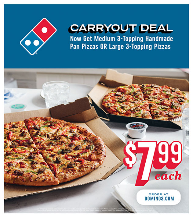
This is the general look of an OSI. The photography will be the main focus of the layout.
The photo should take up about 2/3 of the full layout.
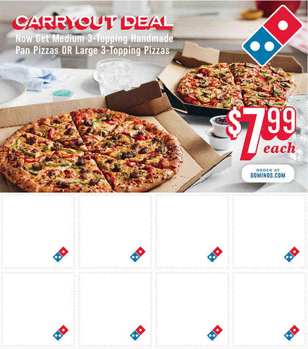
This is the general look of the back page of an OSI. The coupon Section has been updated and simplified.
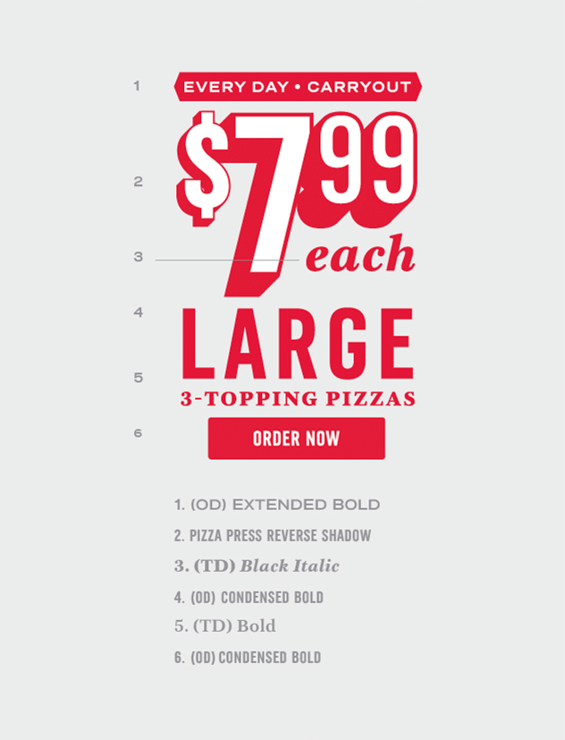
This is a common style of lockup found on an OSI.
In this instance, the offer lockup consists of the offer language and price point.
- Description of offer
- Price point
- Quantity
Promo lockups on print mediums.
1. THE PROMO
In this instance, the promo consists
of these three lines of copy. The promo has been designed so that when paired with the price
point, a unified block of copy is created that stands out in the layout.
1. THE PRICE POINT
Since this is not a digital
asset with embedded links, there is no need to include a CTA (Call To Action) button with this
price point. The price point with the red reverse shadow is used because it allows for better
visibility when placed on top of the photograph.

1. ORDER AT DOMINOS.COM CTA
Use this Order At
Dominos.com" CTA (Call To Action) only on print materials to drive potential customers to order
online. This should not be used on any digital assets.

LOCKUP GUIDELINES
Keep lockups simple and clear without overloading them with too much data.
DON'T USE TOO MANY FONTS
The more fonts you use,
the more visual noise you will create. You want the message to be a quick and effortless read.
THINK ABOUT THE HIERARCHY OF THE MESSAGE
What is
the first thing you want the viewer to see? In the lockup to the right, the order of hierarchy
is:
- $7.99
- Order now
- Large 3-Topping Pizzas
- Every day Carryout
ORDER NOW BUTTON
Only for digital assets where the
"Order Now" button is clickable.
KEEP THE MESSAGING BRIEF
If a lockup is overloaded
with information, we risk overwhelming the reader and discouraging them from reading the
message.