LOGO GUIDELINES
The Domino’s logo is prominent in all communications, whether print, in-store, or online. At minimum the tile logo mark must be used in every Domino’s Communication.
The Domino’s logo is central in our design system. We constantly and repetitively use it as a signature design element in all Domino’s communications.
The logo should never be altered or distorted in any way. Use provided tile logos. Do not re-create the tile logo. More rules listed below.
LOGO USAGE
To Create brand recognition, use the tile logo mark for all cases. The word mark logo should be used in limited capacity.


TILE LOGO
The tile logo should always have a safe area around it at least 100% the diameter of the white dot, or “pip,” in the logo. This gives our logos room to breathe and helps them stand out. No elements may be positioned within this protected zone.
To build brand recognition, use the tile log whenever possible.


Maintain spacing around the logo that is the same dimensions as the pips.
The minimum logo size for the printed materials is .5” along the top-left side.

Maintain spacing around the logo that is the same dimensions as the pips.
The minimum logo size for the printed materials is .5” along the top-left side.
SMALL USE CASE
To ensure legibility at small sizes, a larger more spaced-out legal mark is used. This should be used with most digital assets including: Digital banners, email modules, website tiles, websites and apps.

LEGAL MARK AT 50% PIP SIZE. INTENDED FOR SMALL USE CASES

LEGAL MARK AT 100% PIP SIZE. INTENDED FOR SMALL USE CASES

LEGAL MARK AT 50% PIP SIZE. INTENDED FOR SMALL USE CASES
LARGE USE CASE
Use a smaller more tightly spaced legal mark to ensure it does not appear too large at larger sizes. Should be used with most print and broadcast assets including: OSI's, OOH boards, packaging and TV.

LEGAL MARK AT 30% PIP SIZE. INTENDED FOR LARGE USE CASES

LEGAL MARK AT 50% PIP SIZE. INTENDED FOR LARGE USE CASES

LEGAL MARK AT 30% PIP SIZE. INTENDED FOR LARGE USE CASES
TILE LOGO REGISTRATION MARK (®)
In both large and small versions of the logo, please be aware of the size of the registration marks (®). When scaling, please be sure that you adjust these legal marks to be at an appropriate size.


Do NOT scale down the tile logo with the regular registration mark. The registration mark becomes illegible at smaller sizes. Use the large registration mark for these instances.

This registration mark is enlarged and is meant to be used whenever the tile is very small, like in mobile headers and web banners.
WORD MARK LOGO



This is the Domino's vertical word mark. Although the standalone tile logo is preferred, the Domino's word mark can be used in vertical spaces where no other branding or brand mention is present.
The standalone tile is the preferred Domino's logo for print and digital mediums and platforms.


BRAND NAME GRAPHIC ELEMENTS
The brand name can be used in additional approved typefaces shown below. Use brand name graphic elements to supplement Domino's branding. These elements should not be directly paired with the tile logo.


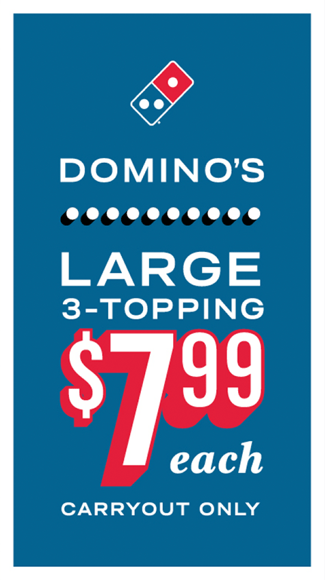
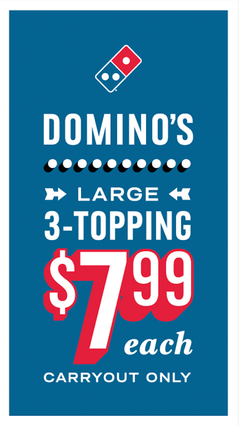
BRAND NAME GRAPHIC DO'S
Below are combinations of Domino's typefaces that should be allowed. Basic rule of thumb is to avoid using too many typefaces in a combination.
BRAND NAME GRAPHIC DO NOT'S
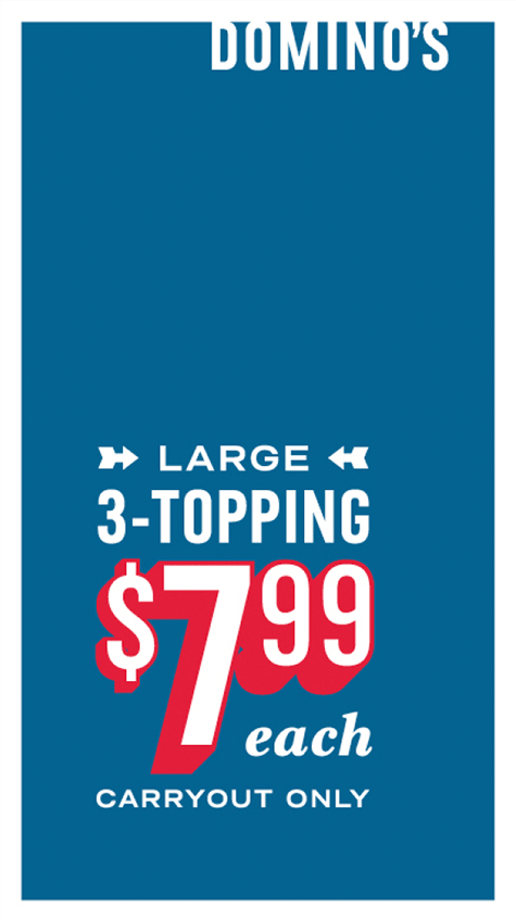
Below are combinations of Domino's typefaces that should be avoided. Basic rule of thumb is to avoid using too many typefaces in a combination.

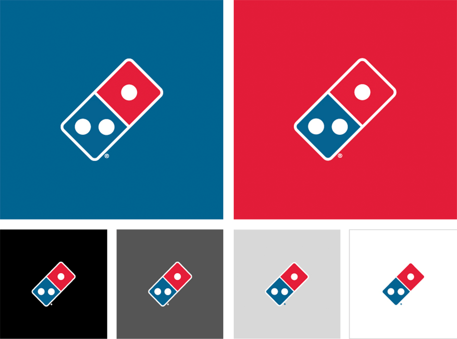
LOGO ON COLOR
The examples shown below illustrate acceptable uses of the Domino's tile logo on various brand colors. The registration mark (*) remains white for saturated tones like blues, reds, and darker grays.
The registration mark inverts to our brand blue when on top of lighter colors such as white and paler shades of gray, red, and blue. Our logo should never appear on non-brand colors.
LOGO ON IMAGE
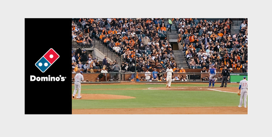
Use the tile logo over approved photography. Avoid placing the logo directly on top of a pizza. Be mindful to place the logo in out-of-focus or empty areas of the image so the logo stands out.

TILE LOGO DO'S


TILE LOGO DO NOT'S


COLOR TYPE USE CASES


HORIZONTAL WORD MARK DO'S


HORIZONTAL WORD MARK DO NOT'S




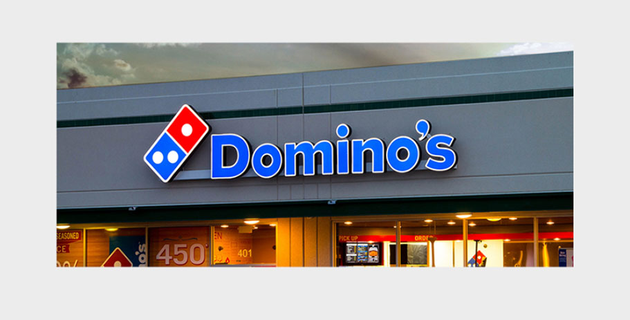
HORIZONTAL WORD MARK IN USE
Use horizontal word mark only on storefronts only if property owners provide wide-format signage.
VERTICAL WORD MARK DO'S


VERTICAL WORD MARK DO NOT'S




VERTICAL WORD MARK IN USE
Use vertical word mark only on storefronts only if property owners provide wide-format signage.
